PLAYHOOD
Unveiling the World of Playful Wonders
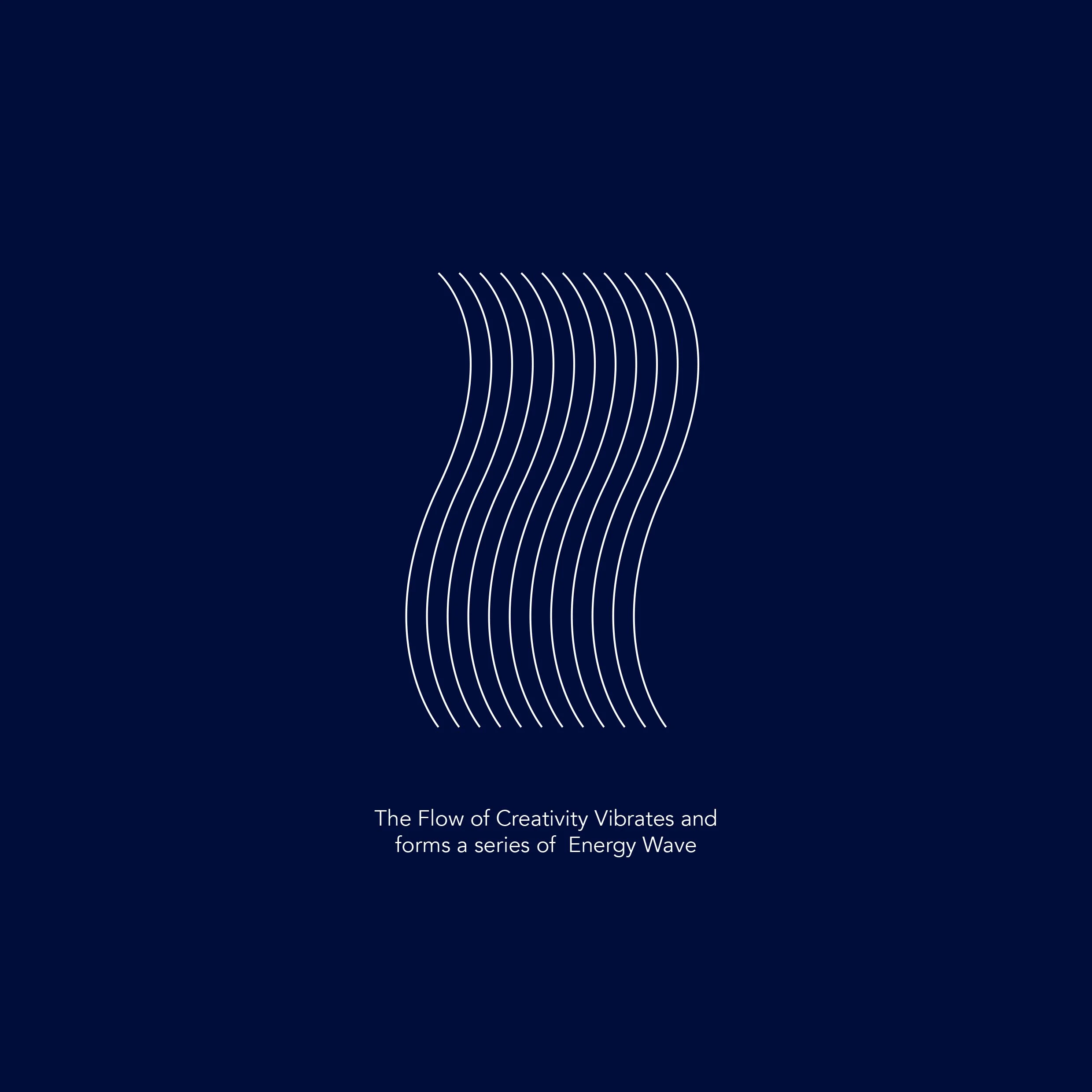
For Playhood, play is more than just an activity – it’s a transformative experience. The brand goes beyond creating a physical space; it crafts an environment that nurtures children’s spirits, fuels their creativity, and allows them to be, simply, kids. Recognising the value of unstructured play, where the only boundaries are set by imagination, DWHQ developed a brand identity that embodies this ethos. An amoeba shape symbolises transformative play that ignites creativity, while the logotype, composed of line forms within the amoeba, represents the "playwave" – a vibrant wave that reflects the energy and vitality of children. This dynamic design captures the essence of joyful exploration and limitless imagination.
Playful Versions of Logo
Infusing Energy and Creativity into the Brand
What is PlayWave? It embodies energy itself. Children are brimming with energy, and this vitality resonates with their emotions. These emotions manifest as creativity, fun, happiness, love, and joy. Our goal is to render this energy visible within the brand, thus we've given shape to this vibrancy in what we term the PlayWave. Beyond this, PlayWave invites to delve into and broaden their creativity, allowing the parents to craft a world of marvels for the kids to revel in!


